Pairs Trading in Python: Cointegration and Mean Reversion

Every directional strategy has the same hidden bet baked into it: that the market keeps going the way it has been going. Long-only momentum, trend following, even most mean-reversion systems — they all live or die by the overall drift of the market. When 2022 arrives and everything correlated to 1 goes down together, the “diversified” book turns out to have been one trade all along.

Pairs trading in Python is the classic escape hatch. Instead of betting on where the market goes, you bet on the relationship between two securities that historically move together: when the gap between them stretches too far, you bet it snaps back. Done right, the position is market-neutral — it can make money in a bull market, a bear market, or a flat one, because it only cares about the spread between two assets, not the level of either.

The catch is that “two things that move together” is not the same as “two things you can trade against each other.” Correlation is not enough, and trading on correlation alone is one of the most expensive beginner mistakes in statistical arbitrage. The tool that actually matters is cointegration.

By the end of this article you will have:

  • A clear intuition for why cointegration — not correlation — is what makes a pair tradeable.
  • A working statsmodels pipeline that tests a pair and builds a tradeable spread.
  • A market-neutral z-score backtest on real ETF data, with the look-ahead traps named out loud.

1. Why a single-asset strategy is a disguised market bet

Suppose you build a beautiful mean-reversion system on a single stock. It buys dips, sells rips, and the equity curve looks smooth. Then the company’s sector rotates out of favor for eighteen months and the stock grinds down the whole time. Your “mean” was a moving target, and every dip you bought was a falling knife.

The problem is that a single price series has no anchor. There is no law of physics that says a stock has to return to any particular level. Its “fair value” drifts with earnings, rates, sentiment, and a hundred other things you are not modeling.

A pair gives you an anchor. If two companies are in the same business — two soft-drink makers, two oil majors, two country ETFs driven by the same commodities — then whatever macro force pushes one up tends to push the other up too. The difference between them, the spread, has a much better claim to being mean-reverting than either price on its own. When one runs ahead of the other for no fundamental reason, you short the expensive leg, buy the cheap leg, and wait for the gap to close. Your exposure to the market as a whole roughly cancels out.

That cancellation is the whole point. It is also where the rigor has to come in, because not every correlated pair has a stable spread.


2. Cointegration vs correlation (the intuition)

Here is the distinction that trips up most people, with no heavy math.

Correlation measures whether two series move in the same direction day to day. Two random walks can be highly correlated over a window and then wander arbitrarily far apart forever. Correlation says nothing about whether they stay close.

Cointegration is stronger: it says that some linear combination of the two series is stationary — it has a stable mean and reverts to it. The two prices can each wander wherever they like, but they are tied together so that the spread between them keeps coming back.

The standard mental picture is the drunk and her dog. The drunk staggers home on a random walk; her dog wanders on its own random walk. Each path on its own is unpredictable and can go anywhere. But they are joined by a leash. The distance between them is bounded — it stretches and contracts but always pulls back. The two positions are non-stationary; the leash (the spread) is stationary. That leash is cointegration, and it is exactly what you trade.

Crucially, two series can be strongly correlated without being cointegrated (they drift apart for good), and — more rarely — cointegrated without being strongly correlated day to day. For pairs trading, cointegration is the property you need, and there is a formal test for it.


3. Setting up the environment

pip install yfinance statsmodels pandas numpy matplotlib

Imports for the whole article:

import numpy as np
import pandas as pd
import yfinance as yf
import matplotlib.pyplot as plt
import statsmodels.api as sm
from statsmodels.tsa.stattools import coint, adfuller

4. Getting data and choosing a candidate pair

A good candidate pair should have an economic reason to move together — that is what stops the relationship from being a coincidence that evaporates out of sample. A textbook example is EWA (the iShares Australia ETF) and EWC (iShares Canada). Both economies are commodity-heavy and rate-sensitive, so the two ETFs are pushed around by similar macro forces.

tickers = ["EWA", "EWC"]
prices = yf.download(tickers, start="2010-01-01", end="2025-01-01",
                     auto_adjust=True)["Close"].dropna()

ewa = prices["EWA"]
ewc = prices["EWC"]

Plot them on the same axis and you will see two lines that clearly travel together but are not glued — exactly the profile you want before running any statistical test.

prices.plot(figsize=(14, 6), title="EWA and EWC closing prices")
plt.ylabel("Price (USD)")
plt.show()

Choosing the pair by eye first, test second matters more than it looks. If you skip the economic story and let an algorithm scan thousands of pairs for the lowest p-value, you walk straight into the data-snooping trap covered in section 8.


5. Testing for cointegration

statsmodels ships the Engle-Granger two-step test as a single function, statsmodels.tsa.stattools.coint. The null hypothesis is no cointegration; a small p-value lets you reject it.

score, pvalue, _ = coint(ewa, ewc)
print(f"Engle-Granger cointegration p-value: {pvalue:.4f}")

A p-value below 0.05 is the usual threshold to treat the pair as cointegrated. Do not stop at a single number, though — the test is sensitive to the sample window. A pair that passes on 2010–2025 may fail on 2015–2020. Re-run the test on a few sub-periods before you trust it.

For intuition, it helps to also run an augmented Dickey-Fuller test directly on the spread once you have built it (next section). Engle-Granger is essentially doing that under the hood, but seeing the ADF p-value on the spread you actually trade makes the result concrete.


6. Building the spread and the z-score signal

Cointegration tells you a stationary combination exists; ordinary least squares tells you the hedge ratio that defines it. Regress one leg on the other and the slope is how many units of EWA you hold against one unit of EWC.

X = sm.add_constant(ewa)
ols = sm.OLS(ewc, X).fit()
hedge_ratio = ols.params["EWA"]

spread = ewc - hedge_ratio * ewa

Confirm the spread is stationary with an augmented Dickey-Fuller test — the null here is non-stationary (a unit root), so again you want a small p-value:

adf_stat, adf_p, *_ = adfuller(spread)
print(f"ADF p-value on the spread: {adf_p:.4f}")

Now turn the spread into a tradeable signal. The raw spread has units of dollars and a level that means nothing on its own; what you care about is how stretched it is right now relative to its recent normal. That is a rolling z-score:

window = 30
spread_mean = spread.rolling(window).mean()
spread_std = spread.rolling(window).std()
zscore = (spread - spread_mean) / spread_std

zscore.plot(figsize=(14, 5), title="Spread z-score (EWC vs EWA)")
plt.axhline(2.0, color="r", ls="--")
plt.axhline(-2.0, color="g", ls="--")
plt.axhline(0.0, color="k", ls="-", lw=0.5)
plt.show()

When the z-score spikes above +2, the spread is unusually rich: short it (short EWC, long EWA). When it drops below -2, the spread is unusually cheap: go long it. When it returns toward zero, close the position. Using a rolling mean and standard deviation rather than the full-sample values is deliberate — it keeps the signal backward-looking, which the next sections lean on hard.


7. Backtesting the pairs trading strategy in Python

The trading rules are a clean z-score band: enter at ±2, exit when the spread normalizes back inside ±0.5.

entry, exit = 2.0, 0.5

longs  = zscore < -entry      # spread cheap  -> long the spread
shorts = zscore >  entry      # spread rich   -> short the spread
exits  = zscore.abs() < exit

position = pd.Series(np.nan, index=zscore.index)
position[longs]  = 1
position[shorts] = -1
position[exits]  = 0
position = position.ffill().fillna(0)

Now the part that separates an honest backtest from a marketing chart. The daily profit of holding the dollar-neutral spread is the position (set yesterday) times the change in the spread. The shift(1) is non-negotiable: you can only act on a z-score after the bar that produced it has closed.

spread_ret = spread.diff()
gross = (ewc + hedge_ratio * ewa)          # capital tied up in both legs
strategy_ret = position.shift(1) * spread_ret / gross.shift(1)

equity = (1 + strategy_ret.fillna(0)).cumprod()
equity.plot(figsize=(14, 6),
            title="Market-neutral pairs trading equity curve")
plt.ylabel("Growth of 1 unit")
plt.show()

Dividing the spread PnL by the gross capital of the two legs turns the price-unit profit into a percentage return, so the metrics below are interpretable:

def sharpe(r):
    r = r.dropna()
    return np.sqrt(252) * r.mean() / r.std()

def max_dd(equity):
    peak = equity.cummax()
    return (equity / peak - 1).min()

print("Sharpe :", round(sharpe(strategy_ret), 2))
print("Max DD :", round(max_dd(equity), 3))

What you should expect from a real pair like this: a modest Sharpe, long flat stretches where the spread sits inside the band and you hold nothing, and — the selling point — an equity curve whose shape has very little to do with the S&P 500’s. That low correlation to the broad market is the entire reason to bother. A pairs strategy is not there to beat buy-and-hold on raw return; it is there to add a return stream that does not move with everything else you own.


8. The traps that quietly ruin pairs trades

Pairs trading looks deceptively simple, and the simple version hides several ways to fool yourself.

  • Look-ahead in the hedge ratio. The OLS above is fit on the entire sample, so your 2011 spread was defined using a beta computed with 2024 data. In production you must estimate the hedge ratio on a rolling or expanding window of past data only — see section 9. The same caution is why the z-score uses a rolling window rather than the full-sample mean and standard deviation.
  • Cointegration is not permanent. A pair can be cointegrated for a decade and then decouple — a merger, a regulatory change, a commodity shock, a constituent change in one of the ETFs. Re-test on a rolling window and be ready to retire a pair when the relationship breaks. A blown-up spread that never reverts is the pairs trader’s version of a falling knife.
  • Data snooping when scanning pairs. If you brute-force every pair in a 500-stock universe, that is ~125,000 tests. At a 5% threshold you would expect roughly 6,000 “significant” pairs by pure chance. Picking the lowest p-value out of that pile is overfitting one level up. Either start from an economic hypothesis (as we did) or apply a multiple-testing correction and validate out of sample — the same discipline a walk-forward optimization brings to parameter tuning.
  • Costs and the short leg. A pairs strategy trades both legs and flips often, so commissions roughly double and turnover is high. The short leg also carries borrow costs and can occasionally be hard to borrow. Subtract a realistic round-trip cost — cost * abs(position.diff()) — from the returns and watch how much of the edge survives. Marginal pairs frequently do not survive even 5 basis points.
  • In-sample band tuning. The ±2 / ±0.5 thresholds and the 30-day window are knobs. Tune them on the full history and you are curve-fitting. Choose them a priori or validate them out of sample.

A strategy whose failure modes you can list is one you can manage. A pairs backtest that looks flawless is usually one with the look-ahead left in.


9. Beyond a static hedge ratio

The single biggest weakness above is the fixed, full-sample beta. The relationship between two assets drifts over time, and a static hedge ratio slowly goes stale. Two ways to fix it:

Rolling OLS. Re-estimate the hedge ratio on a trailing window so the spread is always defined by recent history only:

roll_window = 252  # one year
hedge_roll = (ewc.rolling(roll_window)
                 .cov(ewa)
              / ewa.rolling(roll_window).var())
spread_dynamic = ewc - hedge_roll * ewa

This removes the look-ahead and adapts to a drifting relationship, at the cost of a noisier hedge ratio.

Kalman filter. A more elegant approach treats the hedge ratio as a hidden state that evolves smoothly and updates it one observation at a time — no arbitrary window length, and far less jitter than rolling OLS. The pykalman library makes this a few lines; it is a natural follow-up topic in its own right.

For baskets of three or more assets, the Engle-Granger test no longer applies cleanly — reach for the Johansen test (statsmodels.tsa.vector_ar.vecm.coint_johansen), which finds multiple cointegrating relationships at once.


10. Where to go next

A few directions to push this further:

  • Kalman-filter hedge ratios. Replace the static or rolling beta with a Kalman filter for a smoothly time-varying hedge ratio — the standard production upgrade for a pairs book.
  • Half-life of mean reversion. Fit an Ornstein-Uhlenbeck process to the spread to estimate how fast it reverts, then size your z-score window and holding period to match it instead of guessing 30 days.
  • Add a regime filter. Pairs relationships behave differently in calm versus stressed markets. Gate trades on the market state using a regime model — a clean pairing with the HMM market regimes approach.
  • Scale to a universe. Use vectorbt to scan and backtest hundreds of cointegrated pairs quickly, then borrow the falling-knife defenses from the Bollinger Bands and RSI mean-reversion article to manage the ones that decouple.

Conclusion

Pairs trading is the cleanest way to express a view that has nothing to do with where the market is headed. The strategy itself is a few lines of statsmodels — an OLS hedge ratio, a stationary spread, a z-score band. The hard part, and the part that decides whether the thing makes money out of sample, is the discipline around it: testing cointegration honestly, refusing to snoop thousands of pairs, lagging every signal, and accepting that even a good pair can decouple without warning. Get that discipline right and you have something rare in a retail toolkit — a return stream that genuinely zigs when the rest of your book zags.


How to convert a JSON into a HDF5 file

You scraped a bunch of data from a cryptocurrency exchange API into JSON but you figured that it’s taking too much disk space ? Switching to HDF5 will save you some space and make the access very fast, as it’s optimized for I/O operations. The HDF5 format is supported by major tools like Pandas, Numpy and Keras, data integration will be smooth, if you want to do some analysis.

Flattening the JSON

Most of the time JSON data is a giant dictionary with a lot of nested levels, the issue is that HDF5 doesn’t understand that. If we take the below JSON:

json_dict = {'Name':'John', 'Location':{'City':'Los Angeles','State':'CA'}, 'hobbies':['Music', 'Running']}

The result will look like this in a DataFrame:

Nested DataFrame
Nested DataFrame

We need to flatten the JSON to make it look like a classic table:

Flatten DataFrame
Flatten DataFrame

We’re going to use the flatten_json() function (more info here):

def flatten_json(y):
    out = {}
    def flatten(x, name=''):
        if type(x) is dict:
            for a in x:
                flatten(x[a], name + a + '_')
        elif type(x) is list:
            i = 0
            for a in x:
                flatten(a, name + str(i) + '_')
                i += 1
        else:
            out[name[:-1]] = x
    flatten(y)
    return out

Loading into a HDF5 file

Now the idea is to load the flattened JSON dictionary into a DataFrame that we’re going to save in a HDF5 file.

I’m assuming that during scraping we appended each record to the JSON, so we have one dictionary per line:

def json_to_hdf(input_file, output_file):
    
    with pd.HDFStore(output_file) as store:
        with open(input_file, "r") as json_file:
            for i, line in enumerate(json_file):
                try:
                    flat_data = flatten_json(ujson.loads(line))
                    df = pd.DataFrame.from_dict([flat_data])
                    store.append('observations', df)
                except:
                    pass

Let’s break this down.

Line 3: we initialize the HDFStore, this is the HDF5 file, it’s handling the file writing and everything.

Lines 4 & 5: we open the file and read it line per line

Line 7: we transform the line into a JSON dictionary and then we flatten it

Line 8: we transform the flatten dictionary into a Pandas DataFrame

Line 9: we append this DataFrame into the HDFStore

Et voilà, you now have your data in a single HDF5 file, ready to be loaded for your statistical analysis or maybe to generate trading signals, remember, it’s optimized for Pandas and Numpy so it’ll be faster than reading from the original JSON file.

Trading with Coinbase Pro (GDAX) API in Python

Coinbase Pro (formerly known as GDAX) is one of the biggest cryptocurrency exchange, you can trade a large panel of cryptocurrencies against USD, EUR and GBP. I chose to trade on Coinbase Pro because it supports a lot of pairs and the liquidity is usually very good, we can easily implement an algorithmic trading strategy on this exchange.

The most traded currencies are:
– Bitcoin (BTC)
– Ethereum (ETH)
– yearn.finance (YFI)
– Litecoin (LTC)

The Setup

Fortunately for us, Coinbase Pro provides an API to get market data, to get balances for each currency and to send buy/sell orders to the market. You can find a documentation here.

I found a Python wrapper for their API on GitHub, this one is super easy to use.
You can install the package like this:

pip install cbpro

Once it’s installed, you need to insert the appropriate import in your code:

import cbpro

Now you need to get an API key in order to be able to retrieve your account balances and to send orders to the market. If you just want to get market data you can skip that part.
Go to https://pro.coinbase.com/profile/api , click on Create new key, now you have the API key and you may need to get some email validation to see the secret key (which you also need). Check the options you want, if you want to trade via the API, just select the appropriate check box, same for withdrawals.

Using the API

In your code, you need to set up the connection so that you can get authenticated:

auth_client = cbpro.AuthenticatedClient(key, b64secret, passphrase)

If you want to get market data for a ticker. Note that authentication is not required for this method:

auth_client.get_product_order_book('BTC-USD')

Now to send an order, it’s pretty simple:

# Buy 0.01 BTC @ 100 USD
auth_client.buy(price='100.00',#USD
size='0.01',#BTC
order_type='limit',
product_id='BTC-USD')

You’ll get a JSON object, with an id for the order that you can track using auth_client.get_fills(order_id=”d0c4560b-4e6d-41d9-e568-48c4bfca13e6″):

{
"id": "d0c4560b-4e6d-41d9-e568-48c4bfca13e6",
"price": "0.10000000",
"size": "0.01000000",
"product_id": "BTC-USD",
"side": "buy",
"stp": "dc",
"type": "limit",
"time_in_force": "GTC",
"post_only": false,
"created_at": "2020-11-20.T10:12:45.12345Z",
"fill_fees": "0.0000000000000000",
"filled_size": "0.00000000",
"executed_value": "0.0000000000000000",
"status": "pending",
"settled": false
}

To manage your risks, you’ll need to retrieve your balances:

balance = auth_client.get_accounts()
print("ETH="+str(balance[0]["balance"]))

With this basic API you can code any algorithmic strategy in Python for Coinbase Pro, you can try to predict the value of a cryptocurrency using our previous tutorials for example.

Simple strategy backtesting using Zipline

Zipline is a backtesting engine for Python, if you’re a Quantopian member you should be familiar with it since it’s the one they’re using. It provides metrics about the strategy such as returns, standard deviations, Sharpe ratios etc. basically everything you need to know in order to validate or not a strategy before going live.

Zipline can be install using pip:

pip install zipline

If you’re on Windows I suggest using Conda:

conda install -c Quantopian zipline

Here is the basic structure of a strategy in Zipline:

from zipline.api import order, record, symbol
def initialize(context): pass
def handle_data(context, data): order(symbol('AAPL'), 10) record(AAPL=data.current(symbol('AAPL'), 'price'))

In initialize you can set some global variables used for the strategy such as a list of stocks, certain parameters, the maximum percentage of portfolio invested.
Then handle_data is entered at every tick, that’s where your strategy logic should be. You can check previous articles and incorporate strategies into your code.

Let’s breakdown the handle_data() code.

The order() function let you create an order, here we specify the AAPL ticker (Apple stock) with a quantity of 10. A positive value means you’re buying 10 stocks, a negative value would mean you’re selling the stock.

Then, the record() function allows you to save the value of a variable at each iteration. Here, you’re saving the current stock price under the variable named AAPL, you’ll then be able to retrieve that information in the backtest result, this way you can compare your strategy performance versus the stock price.

Now you want to finally backtest the strategy and see if it’s profitable. To do that, run the following command:

zipline run -f your_strategy.py --start 2015-1-1 --end 2020-1-1 -o your_strategy.pickle

This command is going to run the backtest between 2015-01-01 and 2020-01-01 and output the result into a pickle file for later analysis. The pickle is simply a Pandas DataFrame with a line per day and (a lot of) columns regarding your strategy, such as the return, the number of orders, the portofolio size and so on.


How to use a Random Forest classifier in Python using Scikit-Learn

Random Forest is a powerful machine learning algorithm, it can be used as a regressor or as a classifier. It’s a meta estimator, meaning it’s using a specified number of decision trees to fit and predict.

We’re going to use the package Scikit-Learn in Python, it’s a very useful library which contains a lot of machine learning algorithms and related tools.

Data preparation

To see how Random Forest can be applied, we’re going to try to predict the S&P 500 futures (E-Mini), you can get the data for free on Quandl. Here is what it looks like:

[table] Date,Open,High,Low,Last,Change,Settle,Volume,Previous Day Open Interest
2016-12-30,2246.25,2252.75,2228.0,2233.5,8.75,2236.25,1252004.0,2752438.0
2016-12-29,2245.5,2250.0,2239.5,2246.25,0.25,2245.0,883279.0,2758174.0
2016-12-28,2261.25,2267.5,2243.5,2244.75,15.75,2245.25,976944.0,2744092.0[/table]

The column Change needs to be removed since there’s missing data and this information can be retrieved directly by substracting D close and D-1 close.

Since it’s a classifier, we need to create classes for each line: 1 if the future went up today, -1 if it went down or stayed the same.

import numpy as np
import pandas as pd

def computeClassification(actual):
if(actual > 0):
return 1
else:
return -1

data = pd.DataFrame.from_csv(path='EMini.csv', sep=',')

# Compute the daily returns
data['Return'] = (data['Settle']/data ['Settle'].shift(-1)-1)*100

# Delete the last line which contains NaN
data = data.drop(data.tail(1).index)

# Compute the last column (Y) -1 = down, 1 = up
data.iloc[:,len(data.columns)-1] = data.iloc[:,len(data.columns)-1].apply(computeClassification)

Now that we have a complete dataset with a predictable value, the last colum “Return” which is either -1 or 1, let’s create the train and test dataset.

testData = data[-(len(data)/2):] # 2nd half
trainData = data[:-(len(data)/2)] # 1st half

# X is the list of features (Open, High, Low, Settle)
data_X_train = trainData.iloc[:,0:len(trainData.columns)-1]
# Y is the value to be predicted
data_Y_train = trainData.iloc[:,len(trainData.columns)-1]

# Same thing for the test dataset
data_X_test = testData.iloc[:,0:len(testData.columns)-1]
data_Y_test = testData.iloc[:,len(testData.columns)-1]

Using the algorithm

Once we have everything ready we can start fitting the Random Forest classifier against our train dataset:

from sklearn import ensemble

# I picked 100 randomly, we'll see in another post how to find the optimal value for the number of estimators
clf = ensemble.RandomForestClassifier(n_estimators = 100, n_jobs = -1)
clf.fit(data_X_train, data_Y_train)

predictions = clf.predict(data_X_test)

predictions is an array containing the predicted values (-1 or 1) for the features in data_X_test.
You can see the prediction accuracy using the method accuracy_score which compares the predicted values versus the expected ones.

from sklearn.metrics import accuracy_score

print "Score: "+str(accuracy_score(data_Y_test, y_predictions))

What’s next ?

Now for example you can create a trading strategy that goes long the future if the predicted value is 1, and goes short if it’s -1. This can be easily backtested using a backtest engine such as Zipline in Python.
Based on your backtest result you could add or remove features, maybe the volatility or the 5-day moving average can improve the prediction accuracy ?

Using matplotlib to identify trading signals

Finding trading signals is one of the core problems of algorithmic trading, without any good signals your strategy will be useless. This is a very abstract process as you cannot intuitively guess what signals will make your strategy profitable or not, because of that I’m going to explain how you can have at least a visualization of the signals so that you can see if the signals make sense and introduce them in your algorithm.

We’re going to use matplotlib to graph the asset price and add buy/sell signals on the same graph, this way you can see if the signals are generated at the right moment or not: buy low, sell high.

Data preparation

For this tutorial I picked a very simple strategy which is a crossing moving average, the idea is to buy when the “short” moving average, let’s say 5-day is crossing the “long” moving average, let’s say 20-day, and to sell when they cross the other way.

First of all, we need to install matplotlib via the usual pip:

pip install matplotlib

This example requires pandas and matplotlib:

import pandas as pd
import matplotlib.pyplot as plt

I’m using the E-mini future dataset from Quandl, see this article.

Loading data and computing the moving averages is pretty trivial thanks to Pandas:

data = pd.DataFrame.from_csv(path='EMini.csv', sep=',')

# Generate moving averages
data = data.reindex(index=data.index[::-1]) # Reverse for the moving average computation
data['Mavg5'] = data['Settle'].rolling(window=5).mean()
data['Mavg20'] = data['Settle'].rolling(window=20).mean()

Now the actual signal generation part is a bit more tricky:

# Save moving averages for the day before
prev_short_mavg = data['Mavg5'].shift(1)
prev_long_mavg = data['Mavg20'].shift(1)

# Select buying and selling signals: where moving averages cross
buys = data.ix[(data['Mavg5'] <= data['Mavg20']) & (prev_short_mavg >= prev_long_mavg)]
sells = data.ix[(data['Mavg5'] >= data['Mavg20']) & (prev_short_mavg <= prev_long_mavg)]

buys and sells is now containing all dates where we have a signal.

Plotting the signals

The interesting part is the graphing of this, the syntax is simple:

plt.plot(X, Y)

We want to display the E-Mini price and the moving averages is pretty simple, we use data.index because the dates in the DataFrame are in the index:

# The label parameter is useful for the legend
plt.plot(data.index, data['Settle'], label='E-Mini future price')
plt.plot(data.index, data['Mavg5'], label='5-day moving average')
plt.plot(data.index, data['Mavg20'], label='20-day moving average')

But for the signals, we want to put each marker at the specific date, which is in the index, and at the E-Mini price level so that visually it’s not too confusing:

plt.plot(buys.index, data.ix[buys.index]['Settle'], '^', markersize=10, color='g')
plt.plot(sells.index, data.ix[sells.index]['Settle'], 'v', markersize=10, color='r')

data.ix[buys.index][‘Settle’] means we take the ‘Settle’ field in the data DataFrame

plt.ylabel('E-Mini future price')
plt.xlabel('Date')
plt.legend(loc=0)
plt.show()

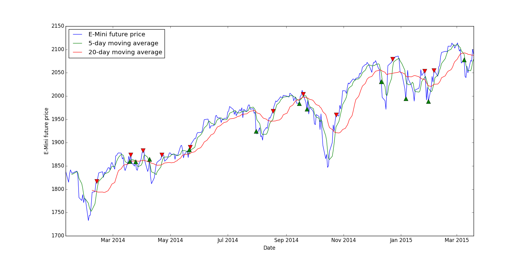
Here is the final result:

Conclusion

In conclusion, you can interpret this by noticing that most buying signals are at dips in the curve and selling signals are at local maximums. So our signal generation looks promising, however without a real backtest we cannot be sure that the strategy will be profitable, at least we can validate or not a signal.
The main advantage of this method is that we can instantly see if the signals are “right” or not, for example you can play with the short and long moving average, you could try 10-day versus 30-day etc. and in the end you can pick the right parameters for this signal.

Create a trading strategy from scratch in Python

To show you the full process of creating a trading strategy, I’m going to work on a super simple strategy based on the VIX and its futures. I’m just skipping the data downloading from Quandl, I’m using the VIX index from here and the VIX futures from here, only the VX1 and VX2 continuous contracts datasets.

Data loading

First we need to load all the necessary imports, the backtest import will be used later:

import pandas as pd
import numpy as np
import matplotlib.pyplot as plt
from backtest import backtest
from datetime import datetime

For the sake of simplicity, I’m going to put all values in one DataFrame and in different columns. We have the VIX index, VX1 and VX2, this gives us this code:

VIX = "VIX.csv"
VIX1 = "VX1.csv"
VIX2 = "VX2.csv"

data = []
fileList = []
# Create the base DataFrame
data = pd.DataFrame()

fileList.append(VIX)
fileList.append(VIX1)
fileList.append(VIX2)

# Iterate through all files
for file in fileList:
# Only keep the Close column
tmp = pd.DataFrame(pd.DataFrame.from_csv(path=file, sep=',')['Close'])

# Rename the Close column to the correct index/future name
tmp.rename(columns={'Close': file.replace(".csv", "")}, inplace=True)

# Merge with data already loaded
# It's like a SQL join on the dates
data = data.join(tmp, how = 'right')

# Resort by the dates, in case the join messed up the order
data = data.sort_index()

And here’s the result:
[table]
Date,VIX,VX1,VX2
02/01/2008,23.17,23.83,24.42
03/01/2008,22.49,23.30,24.60
04/01/2008,23.94,24.65,25.37
07/01/2008,23.79,24.07,24.79
08/01/2008,25.43,25.53,26.10
[/table]

Signals

For this tutorial I’m going to use a very basic signal, the structure is the same and you can replace the logic with your whatever strategy you want, using very complex machine learning algos or just crossing moving averages.

The VIX is a mean-reverting asset, at least in theory, it means it will go up and down but in the end its value will move around an average. Our strategy will be to go short when it’s way higher than its mean value and to go short when it’s very low, based on absolute values to keep it simple.

high = 65
low = 12

# By default, set everything to 0
data['Signal'] = 0

# For each day where the VIX is higher than 65, we set the signal to -1 which means: go short
data.loc[data['VIX'] > high, 'Signal'] = -1

# Go long when the VIX is lower than 12
data.loc[data['VIX'] < low, 'Signal'] = 1

# We store only days where we go long/short, so that we can display them on the graph
buys = data.ix[data['Signal'] == 1]
sells = data.ix[data['Signal'] == -1]

Now we’d like to visualize the signal to check if, at least, the strategy looks profitable:

# Plot the VX1, not the VIX since we're going to trade the future and not the index directly
plt.plot(data.index, data['VX1'], label='VX1')
# Plot the buy and sell signals on the same plot
plt.plot(sells.index, data.ix[sells.index]['VX1'], 'v', markersize=10, color='r')
plt.plot(buys.index, data.ix[buys.index]['VX1'], '^', markersize=10, color='g')
plt.ylabel('Price')
plt.xlabel('Date')
plt.legend(loc=0)
# Display everything
plt.show()

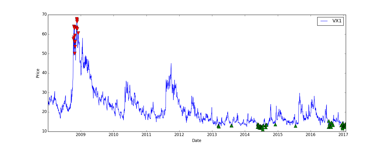
The result is quite good, even though there’s no trade between 2009 and 2013, we could improve that later:

Backtesting

Let’s check if the strategy is profitable and get some metrics. We’re going to compare our strategy returns with the “Buy and Hold” strategy, which means we just buy the VX1 future and wait (and roll it at each expiry), this way we can see if our strategy is more profitable than a passive one.
I put the backtest method in a separate file to make the main code less heavy, but you can keep the method in the same file:

import numpy as np
import pandas as pd

# data = prices + dates at least
def backtest(data):
cash = 100000
position = 0
total = 0

data['Total'] = 100000
data['BuyHold'] = 100000
# To compute the Buy and Hold value, I invest all of my cash in the VX1 on the first day of the backtest
positionBeginning = int(100000/float(data.iloc[0]['VX1']))
increment = 1000

for row in data.iterrows():
price = float(row[1]['VX1'])
signal = float(row[1]['Signal'])

if(signal > 0 and cash - increment * price > 0):
# Buy
cash = cash - increment * price
position = position + increment
print(row[0].strftime('%d %b %Y')+" Position = "+str(position)+" Cash = "+str(cash)+" // Total = {:,}".format(int(position*price+cash)))

elif(signal < 0 and abs(position*price) < cash):
# Sell
cash = cash + increment * price
position = position - increment
print(row[0].strftime('%d %b %Y')+" Position = "+str(position)+" Cash = "+str(cash)+" // Total = {:,}".format(int(position*price+cash)))

data.loc[data.index == row[0], 'Total'] = float(position*price+cash)
data.loc[data.index == row[0], 'BuyHold'] = price*positionBeginning

return position*price+cash

In the main code I’m going to use the backtest method like this:

# Backtest
backtestResult = int(backtest(data))
print(("Backtest => {:,} USD").format(backtestResult))
perf = (float(backtestResult)/100000-1)*100
daysDiff = (data.tail(1).index.date-data.head(1).index.date)[0].days
perf = (perf/(daysDiff))*360
print("Annual return => "+str(perf)+"%")
print()

# Buy and Hold
perfBuyAndHold = float(data.tail(1)['VX1'])/float(data.head(1)['VX1'])-1
print(("Buy and Hold => {:,} USD").format(int((1+perfBuyAndHold)*100000)))
perfBuyAndHold = (perfBuyAndHold/(daysDiff))*360
print("Annual return => "+str(perfBuyAndHold*100)+"%")
print()

# Compute Sharpe ratio
data["Return"] = data["Total"]/data["Total"].shift(1)-1
volatility = data["Return"].std()*252
sharpe = perf/volatility
print("Volatility => "+str(volatility)+"%")
print("Sharpe => "+str(sharpe))

It’s important to display the annualized return, a strategy with a 20% return over 10 years is different than a 20% return over 2 months, we annualize everything so that we can compare strategies easily. The Sharpe Ratio is a useful metric, it allows us to see if the return is worth the risk, in this example I just assumed a 0% risk-free rate, if the ratio is > 1 it means the risk-adjusted return is interesting, if it’s > 10 it means the risk-adjusted return is very interesting, basically high return for a low volatility.
In our example we have a pretty nice Sharpe ratio of 4.6 which is quite good:

Backtest => 453,251 USD
Annual return => 38.3968478261%

Buy and Hold => 53,294 USD
Annual return => -5.07672097648%

Volatility => 8.34645515332%
Sharpe => 4.60037789945

Finally, we want to plot the strategy PnL vs the “Buy and hold” PnL:

plt.plot(data.index, data['Total'], label='Total', color='g')
plt.plot(data.index, data['BuyHold'], label='BuyHold', color='r')
plt.xlabel('Date')
plt.legend(loc=0)
plt.show()

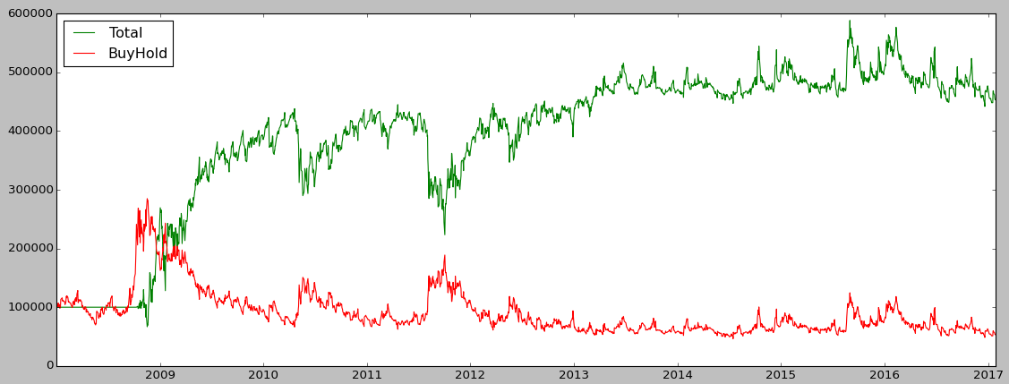
The strategy perfomed very well until 2010 but then from 2013 the PnL starts to stagnate:

Backtest

Conclusion

I showed you a basic structure of creating a strategy, you can adapt it to your needs, for example you can implement your strategy using zipline instead of a custom bactktesting module. With zipline you’ll have way more metrics and you’ll easily be able to run your strategy on different assets, since market data is managed by zipline.
I didn’t mention any transactions fees or bid-ask spread in this post, the backtest doesn’t take into account all of this so maybe if we include them the strategy would lose money!

Load market data from Quandl

In the previous articles, we loaded market data from CSV files, the drawback is that we’d need to redownload the CSV file every day to get latest data. Why not get them directly from the source ? Quandl is a website aggregating market data from various sources: Yahoo Finance, CBOE, LIFFE among others.

Fortunately for us, Quandl has an API in Python which let you access its data. First of all, you’ll need to get your personal API key here, here is a basic code snippet:

import quandl

quandl.ApiConfig.api_key = 'YOUR_API_KEY'
VIXCode = "CHRIS/CBOE_VX1"

VX1 = quandl.get(VIXCode)

The quandl.get() method returns a Pandas data frame with the dates in the index and open/high/low/close data, this depends on the data source, you may get more information like volume etc.

In conclusion now you can directly work with that data frame, you can merge it with other data, apply some calculations and use it as an input in a machine learning algorithm. The main advantage is that you’ll always get the latest data, no need to redownload a file.

Using feature selection to improve a machine learning strategy

For this tutorial, we’re going to assume we have the same basic structure as in the previous article about the Random Forest article. The idea is to do some feature engineering to generate a bunch of features, some of them may be useless and reduce the machine learning algorithm prediction score, that’s where the feature selection comes into action.

Feature engineering

This is not a tentative of a perfect feature engineering, we just want to generate a good number of features and pick the most relevant afterwards. Depending on the dataset you have, you can create more interesting feature like the day, the hour, if it’s the weekend or not etc.
Let’s assume we only have one column, ‘Mid’ which is the mid price between the bid and the ask. We can generate moving average for various windows, 5 to 50 for example, the code is quite simple using pandas:

for i in range(5, 50, 5):
data["mavgMid"+str(i)] = pd.rolling_mean(data["Mid"], i, min_periods=1)

This way we get new columns: MavgMid5, MavgMid10 and so on.
We can also do that for the moving standard deviation which can be useful for a machine learning algorithm, almost the same code as above:

for i in range(5, 50, 5):
data["stdMid"+str(i)] = pd.rolling_std(data["Mid"], i, min_periods=1)

We can continue with various rolling indicators, see the full list here. I personally like rolling_corr() because in the crypto-currencies world, correlation is very volatile and contains a lot of information, especially for inter exchange arbitrage opportunities. In this case you need to add another column with prices from another source.

Here is an example of a full function:

def featureEngineering(data):
# Moving average
for i in range(5, 50, 5):
data["mavgMid"+str(i)] = pd.rolling_mean(data["Mid"], i, min_periods=1)

# Rolling standard deviation
for i in range(5, 50, 5):
data["stdMid"+str(i)] = pd.rolling_std(data["Mid"], i, min_periods=1)

# Remove the 50 last rows since 50 is our max window
data = data.drop(data.head(50).index)

return data

Feature selection

After the feature engineering step we should have 20 features (+1 Signal feature). I ran the algorithm with the same parameters as in the previous article, but on XMR-BTC minute data over a week using the Crypto Compare API (tutorial to come soon) and I got the decent score of 0.53.

That’s a good score but maybe our 20 features are messing with the Random Forest ability to predict.

We’re going to use the SelectKBest algorithm from Sci-kit learn which is quite efficient for a simple strategy, we need to add some import in the code first:

from sklearn.feature_selection import SelectKBest, f_classif

SelectKBest() takes 2 parameters at minimum: an algorithm, here we picked f_classif since we’re using Random Forest Classifier and the number of features you want to keep:

data_X_train = SelectKBest(f_classif, k=10).fit_transform(data_X_train, data_Y_train)
data_X_test = SelectKBest(f_classif, k=10).fit_transform(data_X_test, data_Y_test)

Now data_X_train and data_X_test contains 10 features each, selected using the f_classif algorithm.

Finally the score I got with my XMR-BTC dataset is 0.60, 6% is a pretty nice improvement for a basic feature selection. I picked 10 randomly as a number of feature to keep, but you can loop through different number to determine the best number of features, but be careful of over fitting!