How to use a Random Forest classifier in Python using Scikit-Learn

Random Forest is a powerful machine learning algorithm, it can be used as a regressor or as a classifier. It’s a meta estimator, meaning it’s using a specified number of decision trees to fit and predict.

We’re going to use the package Scikit-Learn in Python, it’s a very useful library which contains a lot of machine learning algorithms and related tools.

Data preparation

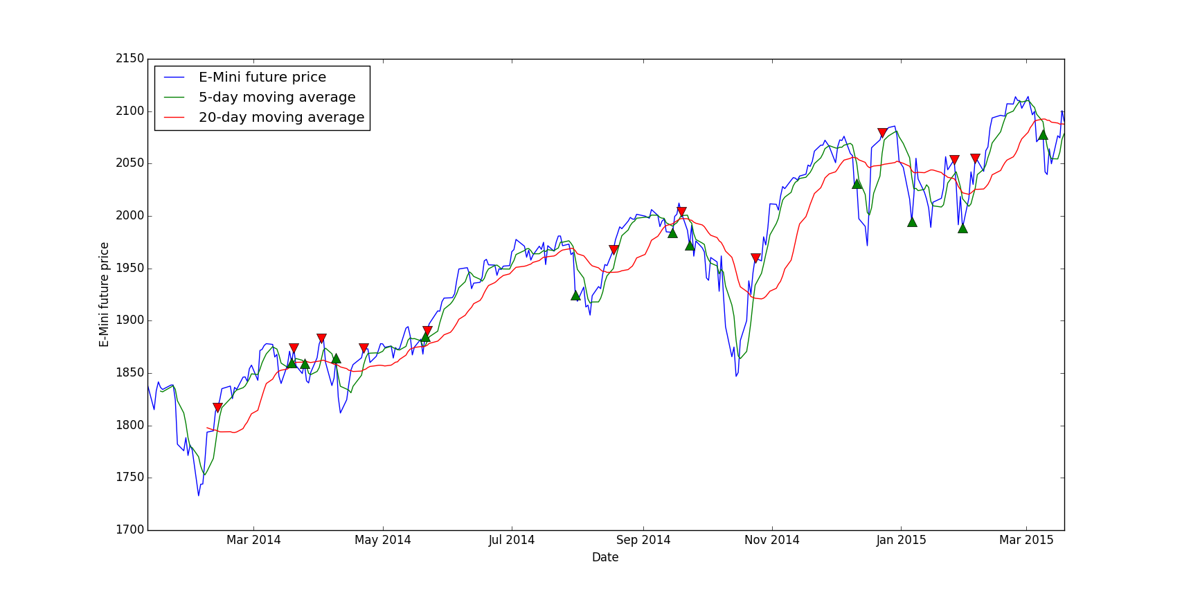
To see how Random Forest can be applied, we’re going to try to predict the S&P 500 futures (E-Mini), you can get the data for free on Quandl. Here is what it looks like:

Date Open High Low Last Change Settle Volume Previous Day Open Interest
2016-12-30 2246.25 2252.75 2228.0 2233.5 8.75 2236.25 1252004.0 2752438.0
2016-12-29 2245.5 2250.0 2239.5 2246.25 0.25 2245.0 883279.0 2758174.0
2016-12-28 2261.25 2267.5 2243.5 2244.75 15.75 2245.25 976944.0 2744092.0

The column Change needs to be removed since there’s missing data and this information can be retrieved directly by substracting D close and D-1 close.

Since it’s a classifier, we need to create classes for each line: 1 if the future went up today, -1 if it went down or stayed the same.

import numpy as np
import pandas as pd

def computeClassification(actual):
if(actual > 0):
return 1
else:
return -1

data = pd.DataFrame.from_csv(path='EMini.csv', sep=',')

# Compute the daily returns
data['Return'] = (data['Settle']/data ['Settle'].shift(-1)-1)*100

# Delete the last line which contains NaN
data = data.drop(data.tail(1).index)

# Compute the last column (Y) -1 = down, 1 = up
data.iloc[:,len(data.columns)-1] = data.iloc[:,len(data.columns)-1].apply(computeClassification)

Now that we have a complete dataset with a predictable value, the last colum “Return” which is either -1 or 1, let’s create the train and test dataset.

testData = data[-(len(data)/2):] # 2nd half
trainData = data[:-(len(data)/2)] # 1st half

# X is the list of features (Open, High, Low, Settle)
data_X_train = trainData.iloc[:,0:len(trainData.columns)-1]
# Y is the value to be predicted
data_Y_train = trainData.iloc[:,len(trainData.columns)-1]

# Same thing for the test dataset
data_X_test = testData.iloc[:,0:len(testData.columns)-1]
data_Y_test = testData.iloc[:,len(testData.columns)-1]

Using the algorithm

Once we have everything ready we can start fitting the Random Forest classifier against our train dataset:

from sklearn import ensemble

# I picked 100 randomly, we'll see in another post how to find the optimal value for the number of estimators
clf = ensemble.RandomForestClassifier(n_estimators = 100, n_jobs = -1)
clf.fit(data_X_train, data_Y_train)

predictions = clf.predict(data_X_test)

predictions is an array containing the predicted values (-1 or 1) for the features in data_X_test.
You can see the prediction accuracy using the method accuracy_score which compares the predicted values versus the expected ones.

from sklearn.metrics import accuracy_score

print "Score: "+str(accuracy_score(data_Y_test, y_predictions))

What’s next ?

Now for example you can create a trading strategy that goes long the future if the predicted value is 1, and goes short if it’s -1. This can be easily backtested using a backtest engine such as Zipline in Python.
Based on your backtest result you could add or remove features, maybe the volatility or the 5-day moving average can improve the prediction accuracy ?

Using matplotlib to identify trading signals

Finding trading signals is one of the core problems of algorithmic trading, without any good signals your strategy will be useless. This is a very abstract process as you cannot intuitively guess what signals will make your strategy profitable or not, because of that I’m going to explain how you can have at least a visualization of the signals so that you can see if the signals make sense and introduce them in your algorithm.

We’re going to use matplotlib to graph the asset price and add buy/sell signals on the same graph, this way you can see if the signals are generated at the right moment or not: buy low, sell high.

Data preparation

For this tutorial I picked a very simple strategy which is a crossing moving average, the idea is to buy when the “short” moving average, let’s say 5-day is crossing the “long” moving average, let’s say 20-day, and to sell when they cross the other way.

First of all, we need to install matplotlib via the usual pip:

pip install matplotlib

This example requires pandas and matplotlib:

import pandas as pd
import matplotlib.pyplot as plt

I’m using the E-mini future dataset from Quandl, see this article.

Loading data and computing the moving averages is pretty trivial thanks to Pandas:

data = pd.DataFrame.from_csv(path='EMini.csv', sep=',')

# Generate moving averages
data = data.reindex(index=data.index[::-1]) # Reverse for the moving average computation
data['Mavg5'] = data['Settle'].rolling(window=5).mean()
data['Mavg20'] = data['Settle'].rolling(window=20).mean()

Now the actual signal generation part is a bit more tricky:

# Save moving averages for the day before
prev_short_mavg = data['Mavg5'].shift(1)
prev_long_mavg = data['Mavg20'].shift(1)

# Select buying and selling signals: where moving averages cross
buys = data.ix[(data['Mavg5'] <= data['Mavg20']) & (prev_short_mavg >= prev_long_mavg)]
sells = data.ix[(data['Mavg5'] >= data['Mavg20']) & (prev_short_mavg <= prev_long_mavg)]

buys and sells is now containing all dates where we have a signal.

Plotting the signals

The interesting part is the graphing of this, the syntax is simple:

plt.plot(X, Y)

We want to display the E-Mini price and the moving averages is pretty simple, we use data.index because the dates in the DataFrame are in the index:

# The label parameter is useful for the legend
plt.plot(data.index, data['Settle'], label='E-Mini future price')
plt.plot(data.index, data['Mavg5'], label='5-day moving average')
plt.plot(data.index, data['Mavg20'], label='20-day moving average')

But for the signals, we want to put each marker at the specific date, which is in the index, and at the E-Mini price level so that visually it’s not too confusing:

plt.plot(buys.index, data.ix[buys.index]['Settle'], '^', markersize=10, color='g')
plt.plot(sells.index, data.ix[sells.index]['Settle'], 'v', markersize=10, color='r')

data.ix[buys.index][‘Settle’] means we take the ‘Settle’ field in the data DataFrame

plt.ylabel('E-Mini future price')
plt.xlabel('Date')
plt.legend(loc=0)
plt.show()

Here is the final result:

Conclusion

In conclusion, you can interpret this by noticing that most buying signals are at dips in the curve and selling signals are at local maximums. So our signal generation looks promising, however without a real backtest we cannot be sure that the strategy will be profitable, at least we can validate or not a signal.
The main advantage of this method is that we can instantly see if the signals are “right” or not, for example you can play with the short and long moving average, you could try 10-day versus 30-day etc. and in the end you can pick the right parameters for this signal.