Detecting Market Regimes with a Hidden Markov Model in Python (and Adapting Your Strategy Accordingly)

If you have ever backtested a strategy that looked brilliant on one period and fell apart on the next, you have already met the regime problem. Markets are not stationary: a momentum strategy that prints money during a calm bull run can hemorrhage during a choppy bear market. The same indicator, the same parameters, completely different outcomes.

One elegant way to deal with this is to explicitly model the regime the market is in, and let the strategy adapt. In this article we will use a Hidden Markov Model (HMM) in Python to identify market regimes from price data alone, visualize them on a chart, and run a simple backtest that switches behavior depending on the detected regime.

By the end you will have:

  • A clear intuition of what an HMM does (without the dense math).
  • A working hmmlearn pipeline on real market data.
  • A regime-aware backtest you can extend to your own strategies.

1. Why a single model is rarely enough

Imagine fitting a trend-following strategy on the S&P 500 between 2016 and 2019. Steady up-trend, low volatility — the strategy hugs the index and looks great. Now extend the test to 2020 (Covid crash) or 2022 (rate-hike whipsaw). Suddenly the equity curve is a roller-coaster.

The market is not the same animal in every period. Practitioners often describe at least three “moods”:

  • Calm bull: low volatility, positive drift.
  • Volatile bear: high volatility, negative drift.
  • Range / transition: low drift, mixed volatility.

A single set of parameters cannot be optimal in all three. Instead of trying harder on parameter tuning, we can try to classify which mood the market is in and route to the right behavior.

That is exactly what an HMM gives us.


2. The HMM intuition (no heavy math)

A Hidden Markov Model assumes that:

  1. There is a hidden state (the regime) that we cannot directly observe.
  2. We do observe something that depends on the state — in our case, daily returns and volatility.
  3. The hidden state transitions over time according to a Markov chain: the probability of tomorrow’s regime depends only on today’s regime.

In plain English: “The market is in some mood. We don’t see the mood directly, but we see returns that are typical of that mood. Moods tend to persist, but occasionally flip.”

The HMM training step (Baum-Welch / EM) figures out, from the data alone:

  • The statistical signature of each regime (mean and variance of returns).
  • The transition matrix between regimes.
  • The most likely sequence of hidden states (Viterbi).

We don’t have to label anything by hand — it’s unsupervised.


3. Setting up the environment

pip install yfinance hmmlearn pandas numpy matplotlib

Imports:

import numpy as np
import pandas as pd
import yfinance as yf
import matplotlib.pyplot as plt
from hmmlearn.hmm import GaussianHMM

4. Getting the data and building features

We will use the SPY ETF as a proxy for the S&P 500.

data = yf.download("SPY", start="2005-01-01", end="2025-01-01", auto_adjust=True)
data = data[["Close"]].dropna()

data["log_return"] = np.log(data["Close"] / data["Close"].shift(1))
data["vol_20"] = data["log_return"].rolling(20).std()
data = data.dropna()

We feed the HMM two features per day:

  • The daily log-return (captures direction).
  • The 20-day rolling volatility (captures the “calm vs panic” axis).
features = data[["log_return", "vol_20"]].values

Why two features? With only returns, the model often confuses “small positive” with “small negative”. Adding volatility gives it a second axis to separate quiet trends from noisy chop.


5. Training a 3-state Gaussian HMM

model = GaussianHMM(
    n_components=3,
    covariance_type="full",
    n_iter=1000,
    random_state=42,
)
model.fit(features)

hidden_states = model.predict(features)
data["regime"] = hidden_states

Three states is a sensible default that maps well to the bull / bear / range mental model. You can try 2 or 4, but interpretability quickly degrades beyond 4.

Let’s inspect what the model learned:

for i in range(model.n_components):
    mean_ret, mean_vol = model.means_[i]
    print(f"Regime {i}: mean return = {mean_ret:.5f}, mean vol = {mean_vol:.5f}")

Typical output (your numbers will vary slightly):

Regime 0: mean return =  0.00078, mean vol = 0.00650   -> calm bull
Regime 1: mean return = -0.00120, mean vol = 0.02400   -> volatile bear
Regime 2: mean return =  0.00010, mean vol = 0.01200   -> mid / transition

Important: the HMM does not label its states. Regime 0 is not necessarily “bull”; you have to look at the means and re-map them. A clean way:

order = np.argsort(model.means_[:, 0])  # sort by mean return ascending
labels = {order[0]: "bear", order[1]: "range", order[2]: "bull"}
data["regime_name"] = data["regime"].map(labels)

6. Visualizing the regimes on the price chart

fig, ax = plt.subplots(figsize=(14, 6))
colors = {"bull": "tab:green", "range": "tab:gray", "bear": "tab:red"}

for name, color in colors.items():
    mask = data["regime_name"] == name
    ax.scatter(data.index[mask], data["Close"][mask],
               s=4, color=color, label=name)

ax.set_title("SPY price colored by HMM-detected regime")
ax.set_ylabel("Price")
ax.legend()
plt.tight_layout()
plt.show()

You should see the red dots concentrate around 2008, March 2020, and 2022 — exactly the periods every trader remembers as painful. That is a sanity check that the model is picking up something real, not noise.


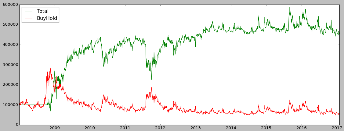
7. A simple regime-aware backtest

The simplest possible rule: be long when the regime is bull, in cash otherwise.

data["signal"] = (data["regime_name"] == "bull").astype(int)
data["signal"] = data["signal"].shift(1)  # avoid look-ahead

data["strategy_ret"] = data["signal"] * data["log_return"]
data["bh_ret"] = data["log_return"]

equity = np.exp(data[["strategy_ret", "bh_ret"]].cumsum())

equity.plot(figsize=(14, 6),
            title="Regime-aware long/cash vs Buy & Hold")
plt.ylabel("Equity (log-return cumulative)")
plt.show()

Useful metrics:

def sharpe(r):
    return np.sqrt(252) * r.mean() / r.std()

def max_dd(equity):
    peak = equity.cummax()
    return (equity / peak - 1).min()

print("Sharpe strategy :", sharpe(data["strategy_ret"].dropna()))
print("Sharpe B&H      :", sharpe(data["bh_ret"].dropna()))
print("Max DD strategy :", max_dd(np.exp(data["strategy_ret"].cumsum())))
print("Max DD B&H      :", max_dd(np.exp(data["bh_ret"].cumsum())))

In most runs you will see the regime-aware version give up some upside in raging bull markets, but cut the worst drawdowns by a wide margin — typically halving the max drawdown while keeping a comparable or better Sharpe. That’s the whole point: the goal is not to beat buy & hold on return, it’s to deliver a smoother ride.


8. The trap you must avoid: look-ahead bias

The code above has a subtle but fatal flaw if you copy it into production: we fit the HMM once, on the entire dataset, and then label the past. That means our 2008 regime labels were informed by 2024 data. In a live setting you obviously don’t have that.

The honest version uses a walk-forward fit: re-train the HMM periodically on a rolling window of past data only.

window = 252 * 5      # 5 years
step = 21             # re-fit monthly
preds = pd.Series(index=data.index, dtype="float")

for end in range(window, len(data), step):
    train = features[end - window:end]
    test = features[end:end + step]
    m = GaussianHMM(n_components=3, covariance_type="full",
                    n_iter=200, random_state=42).fit(train)
    preds.iloc[end:end + step] = m.predict(test)

You then need to re-map state indices to bull/range/bear inside each window, since the HMM picks state numbers arbitrarily on each fit. This is the boring-but-essential plumbing that separates a real backtest from a marketing chart.


9. Limitations to keep in mind

  • HMM is classification, not prediction. It tells you which regime you are likely in now, not what tomorrow’s return will be.
  • State count is fragile. Two runs with different random seeds or slightly different data can produce qualitatively different states. Always set a seed and check the means.
  • Gaussian assumption is wrong. Returns have fat tails. GaussianHMM works in practice but underestimates extreme moves; consider a Student-t or GARCH-augmented variant if that matters for you.
  • Lag. The model needs a few days of new data before it confidently flips regimes. You will always switch out of “bull” after a meaningful drawdown has started, not before. That is fine if your goal is risk reduction, less fine if you expect early warning.

10. Where to go next

A few directions if you want to push further:

  • Combine with a momentum signal. Take long-momentum trades only when the regime is “bull” or “range”, flat in “bear”. This often beats the raw momentum strategy on risk-adjusted basis.
  • Markov-switching GARCH. Models the volatility process itself as regime-switching. More principled for risk management.
  • Multi-asset features. Feed VIX, credit spreads, or yield-curve slope alongside SPY returns. The HMM can then pick up macro-driven regimes you would never see from price alone.
  • Bayesian HMM (pomegranate, pymc). Gives you posterior probabilities for each regime instead of a hard label — much nicer for position sizing.

Conclusion

A Hidden Markov Model is one of the cheapest, most interpretable tools you can add to a Python trading toolbox to make your strategies regime-aware. In a few dozen lines of code you go from “one strategy, one market” to “different behavior for different market moods”, and the resulting equity curve is usually a lot easier to live with — even when raw returns are similar.

5 Mistakes To Avoid In Your Trading Strategy

#1 Not learning to code

This one is the most important, before starting anything you should learn about programming. Coding will make you assimilate a certain logic that’s close to mathematical formulas and can help you formalize your trading process. It’s essential to be able to understand everything that’s “under the hood”, what if you strategy starts to slow down after a few months and you’re not able to improve it yourself.

You won’t learn programming in a day, you should take your time to learn and understand the process. Fortunately, there are multiple free methods you can use to learn about Python. You can use websites like EDX, Coursera, and Udacity.

#2 Backtesting and training on the same period

Let’s say you found the perfect strategy that makes +300% in the 2014 period, you may want to backtest it on a different period, the strategy may work in that specific time but it could make you lose a lot on another period. This beginner mistake has a name: overfitting. Ideally you want to split your data set into at least 2 parts: train and test. But if you want to have a rock-solid performance, you can try K-Fold cross validation, it’ll split your data set into K parts, train 1 part and test it on the other ones, and so on.

#3 Not backtesting enough

Backtest, backtest and backtest. Use different time periods, adjust the trading size, the strategy could work by buying 100$ worth of stocks at a time but what if you want to scale it ? You could introduce slippage and of course broker fees.

Backtesting is good but paper trading is better, you should run the strategy in real-time but without any broker connection, this way you can simulate how it’s going to behave with current market situation.

#4 Not having a risk management strategy

Risk management is going to make a difference during bear markets or high-volatility periods. You can limit the maximum exposure and ignore any buying signal if you hit the limit, or automatically close any position older than a few days. These are suggestions, it’s important to make sure you won’t get stuck with a growing loss over time.

#5 Having unreliable data

Your strategy will be based on financial data, either real-time, minute or daily data, a single data point can destroy your profits. You need to make sure it’s coming from a reliable source and not some random websites, a good source is Quandl, some of their datasets are free.

Using matplotlib to identify trading signals

Finding trading signals is one of the core problems of algorithmic trading, without any good signals your strategy will be useless. This is a very abstract process as you cannot intuitively guess what signals will make your strategy profitable or not, because of that I’m going to explain how you can have at least a visualization of the signals so that you can see if the signals make sense and introduce them in your algorithm.

We’re going to use matplotlib to graph the asset price and add buy/sell signals on the same graph, this way you can see if the signals are generated at the right moment or not: buy low, sell high.

Data preparation

For this tutorial I picked a very simple strategy which is a crossing moving average, the idea is to buy when the “short” moving average, let’s say 5-day is crossing the “long” moving average, let’s say 20-day, and to sell when they cross the other way.

First of all, we need to install matplotlib via the usual pip:

pip install matplotlib

This example requires pandas and matplotlib:

import pandas as pd
import matplotlib.pyplot as plt

I’m using the E-mini future dataset from Quandl, see this article.

Loading data and computing the moving averages is pretty trivial thanks to Pandas:

data = pd.DataFrame.from_csv(path='EMini.csv', sep=',')

# Generate moving averages
data = data.reindex(index=data.index[::-1]) # Reverse for the moving average computation
data['Mavg5'] = data['Settle'].rolling(window=5).mean()
data['Mavg20'] = data['Settle'].rolling(window=20).mean()

Now the actual signal generation part is a bit more tricky:

# Save moving averages for the day before
prev_short_mavg = data['Mavg5'].shift(1)
prev_long_mavg = data['Mavg20'].shift(1)

# Select buying and selling signals: where moving averages cross
buys = data.ix[(data['Mavg5'] <= data['Mavg20']) & (prev_short_mavg >= prev_long_mavg)]
sells = data.ix[(data['Mavg5'] >= data['Mavg20']) & (prev_short_mavg <= prev_long_mavg)]

buys and sells is now containing all dates where we have a signal.

Plotting the signals

The interesting part is the graphing of this, the syntax is simple:

plt.plot(X, Y)

We want to display the E-Mini price and the moving averages is pretty simple, we use data.index because the dates in the DataFrame are in the index:

# The label parameter is useful for the legend
plt.plot(data.index, data['Settle'], label='E-Mini future price')
plt.plot(data.index, data['Mavg5'], label='5-day moving average')
plt.plot(data.index, data['Mavg20'], label='20-day moving average')

But for the signals, we want to put each marker at the specific date, which is in the index, and at the E-Mini price level so that visually it’s not too confusing:

plt.plot(buys.index, data.ix[buys.index]['Settle'], '^', markersize=10, color='g')
plt.plot(sells.index, data.ix[sells.index]['Settle'], 'v', markersize=10, color='r')

data.ix[buys.index][‘Settle’] means we take the ‘Settle’ field in the data DataFrame

plt.ylabel('E-Mini future price')
plt.xlabel('Date')
plt.legend(loc=0)
plt.show()

Here is the final result:

Conclusion

In conclusion, you can interpret this by noticing that most buying signals are at dips in the curve and selling signals are at local maximums. So our signal generation looks promising, however without a real backtest we cannot be sure that the strategy will be profitable, at least we can validate or not a signal.
The main advantage of this method is that we can instantly see if the signals are “right” or not, for example you can play with the short and long moving average, you could try 10-day versus 30-day etc. and in the end you can pick the right parameters for this signal.

Create a trading strategy from scratch in Python

To show you the full process of creating a trading strategy, I’m going to work on a super simple strategy based on the VIX and its futures. I’m just skipping the data downloading from Quandl, I’m using the VIX index from here and the VIX futures from here, only the VX1 and VX2 continuous contracts datasets.

Data loading

First we need to load all the necessary imports, the backtest import will be used later:

import pandas as pd
import numpy as np
import matplotlib.pyplot as plt
from backtest import backtest
from datetime import datetime

For the sake of simplicity, I’m going to put all values in one DataFrame and in different columns. We have the VIX index, VX1 and VX2, this gives us this code:

VIX = "VIX.csv"
VIX1 = "VX1.csv"
VIX2 = "VX2.csv"

data = []
fileList = []
# Create the base DataFrame
data = pd.DataFrame()

fileList.append(VIX)
fileList.append(VIX1)
fileList.append(VIX2)

# Iterate through all files
for file in fileList:
# Only keep the Close column
tmp = pd.DataFrame(pd.DataFrame.from_csv(path=file, sep=',')['Close'])

# Rename the Close column to the correct index/future name
tmp.rename(columns={'Close': file.replace(".csv", "")}, inplace=True)

# Merge with data already loaded
# It's like a SQL join on the dates
data = data.join(tmp, how = 'right')

# Resort by the dates, in case the join messed up the order
data = data.sort_index()

And here’s the result:
[table]
Date,VIX,VX1,VX2
02/01/2008,23.17,23.83,24.42
03/01/2008,22.49,23.30,24.60
04/01/2008,23.94,24.65,25.37
07/01/2008,23.79,24.07,24.79
08/01/2008,25.43,25.53,26.10
[/table]

Signals

For this tutorial I’m going to use a very basic signal, the structure is the same and you can replace the logic with your whatever strategy you want, using very complex machine learning algos or just crossing moving averages.

The VIX is a mean-reverting asset, at least in theory, it means it will go up and down but in the end its value will move around an average. Our strategy will be to go short when it’s way higher than its mean value and to go short when it’s very low, based on absolute values to keep it simple.

high = 65
low = 12

# By default, set everything to 0
data['Signal'] = 0

# For each day where the VIX is higher than 65, we set the signal to -1 which means: go short
data.loc[data['VIX'] > high, 'Signal'] = -1

# Go long when the VIX is lower than 12
data.loc[data['VIX'] < low, 'Signal'] = 1

# We store only days where we go long/short, so that we can display them on the graph
buys = data.ix[data['Signal'] == 1]
sells = data.ix[data['Signal'] == -1]

Now we’d like to visualize the signal to check if, at least, the strategy looks profitable:

# Plot the VX1, not the VIX since we're going to trade the future and not the index directly
plt.plot(data.index, data['VX1'], label='VX1')
# Plot the buy and sell signals on the same plot
plt.plot(sells.index, data.ix[sells.index]['VX1'], 'v', markersize=10, color='r')
plt.plot(buys.index, data.ix[buys.index]['VX1'], '^', markersize=10, color='g')
plt.ylabel('Price')
plt.xlabel('Date')
plt.legend(loc=0)
# Display everything
plt.show()

The result is quite good, even though there’s no trade between 2009 and 2013, we could improve that later:

Backtesting

Let’s check if the strategy is profitable and get some metrics. We’re going to compare our strategy returns with the “Buy and Hold” strategy, which means we just buy the VX1 future and wait (and roll it at each expiry), this way we can see if our strategy is more profitable than a passive one.
I put the backtest method in a separate file to make the main code less heavy, but you can keep the method in the same file:

import numpy as np
import pandas as pd

# data = prices + dates at least
def backtest(data):
cash = 100000
position = 0
total = 0

data['Total'] = 100000
data['BuyHold'] = 100000
# To compute the Buy and Hold value, I invest all of my cash in the VX1 on the first day of the backtest
positionBeginning = int(100000/float(data.iloc[0]['VX1']))
increment = 1000

for row in data.iterrows():
price = float(row[1]['VX1'])
signal = float(row[1]['Signal'])

if(signal > 0 and cash - increment * price > 0):
# Buy
cash = cash - increment * price
position = position + increment
print(row[0].strftime('%d %b %Y')+" Position = "+str(position)+" Cash = "+str(cash)+" // Total = {:,}".format(int(position*price+cash)))

elif(signal < 0 and abs(position*price) < cash):
# Sell
cash = cash + increment * price
position = position - increment
print(row[0].strftime('%d %b %Y')+" Position = "+str(position)+" Cash = "+str(cash)+" // Total = {:,}".format(int(position*price+cash)))

data.loc[data.index == row[0], 'Total'] = float(position*price+cash)
data.loc[data.index == row[0], 'BuyHold'] = price*positionBeginning

return position*price+cash

In the main code I’m going to use the backtest method like this:

# Backtest
backtestResult = int(backtest(data))
print(("Backtest => {:,} USD").format(backtestResult))
perf = (float(backtestResult)/100000-1)*100
daysDiff = (data.tail(1).index.date-data.head(1).index.date)[0].days
perf = (perf/(daysDiff))*360
print("Annual return => "+str(perf)+"%")
print()

# Buy and Hold
perfBuyAndHold = float(data.tail(1)['VX1'])/float(data.head(1)['VX1'])-1
print(("Buy and Hold => {:,} USD").format(int((1+perfBuyAndHold)*100000)))
perfBuyAndHold = (perfBuyAndHold/(daysDiff))*360
print("Annual return => "+str(perfBuyAndHold*100)+"%")
print()

# Compute Sharpe ratio
data["Return"] = data["Total"]/data["Total"].shift(1)-1
volatility = data["Return"].std()*252
sharpe = perf/volatility
print("Volatility => "+str(volatility)+"%")
print("Sharpe => "+str(sharpe))

It’s important to display the annualized return, a strategy with a 20% return over 10 years is different than a 20% return over 2 months, we annualize everything so that we can compare strategies easily. The Sharpe Ratio is a useful metric, it allows us to see if the return is worth the risk, in this example I just assumed a 0% risk-free rate, if the ratio is > 1 it means the risk-adjusted return is interesting, if it’s > 10 it means the risk-adjusted return is very interesting, basically high return for a low volatility.
In our example we have a pretty nice Sharpe ratio of 4.6 which is quite good:

Backtest => 453,251 USD
Annual return => 38.3968478261%

Buy and Hold => 53,294 USD
Annual return => -5.07672097648%

Volatility => 8.34645515332%
Sharpe => 4.60037789945

Finally, we want to plot the strategy PnL vs the “Buy and hold” PnL:

plt.plot(data.index, data['Total'], label='Total', color='g')
plt.plot(data.index, data['BuyHold'], label='BuyHold', color='r')
plt.xlabel('Date')
plt.legend(loc=0)
plt.show()

The strategy perfomed very well until 2010 but then from 2013 the PnL starts to stagnate:

Backtest

Conclusion

I showed you a basic structure of creating a strategy, you can adapt it to your needs, for example you can implement your strategy using zipline instead of a custom bactktesting module. With zipline you’ll have way more metrics and you’ll easily be able to run your strategy on different assets, since market data is managed by zipline.
I didn’t mention any transactions fees or bid-ask spread in this post, the backtest doesn’t take into account all of this so maybe if we include them the strategy would lose money!

Using feature selection to improve a machine learning strategy

For this tutorial, we’re going to assume we have the same basic structure as in the previous article about the Random Forest article. The idea is to do some feature engineering to generate a bunch of features, some of them may be useless and reduce the machine learning algorithm prediction score, that’s where the feature selection comes into action.

Feature engineering

This is not a tentative of a perfect feature engineering, we just want to generate a good number of features and pick the most relevant afterwards. Depending on the dataset you have, you can create more interesting feature like the day, the hour, if it’s the weekend or not etc.
Let’s assume we only have one column, ‘Mid’ which is the mid price between the bid and the ask. We can generate moving average for various windows, 5 to 50 for example, the code is quite simple using pandas:

for i in range(5, 50, 5):
data["mavgMid"+str(i)] = pd.rolling_mean(data["Mid"], i, min_periods=1)

This way we get new columns: MavgMid5, MavgMid10 and so on.
We can also do that for the moving standard deviation which can be useful for a machine learning algorithm, almost the same code as above:

for i in range(5, 50, 5):
data["stdMid"+str(i)] = pd.rolling_std(data["Mid"], i, min_periods=1)

We can continue with various rolling indicators, see the full list here. I personally like rolling_corr() because in the crypto-currencies world, correlation is very volatile and contains a lot of information, especially for inter exchange arbitrage opportunities. In this case you need to add another column with prices from another source.

Here is an example of a full function:

def featureEngineering(data):
# Moving average
for i in range(5, 50, 5):
data["mavgMid"+str(i)] = pd.rolling_mean(data["Mid"], i, min_periods=1)

# Rolling standard deviation
for i in range(5, 50, 5):
data["stdMid"+str(i)] = pd.rolling_std(data["Mid"], i, min_periods=1)

# Remove the 50 last rows since 50 is our max window
data = data.drop(data.head(50).index)

return data

Feature selection

After the feature engineering step we should have 20 features (+1 Signal feature). I ran the algorithm with the same parameters as in the previous article, but on XMR-BTC minute data over a week using the Crypto Compare API (tutorial to come soon) and I got the decent score of 0.53.

That’s a good score but maybe our 20 features are messing with the Random Forest ability to predict.

We’re going to use the SelectKBest algorithm from Sci-kit learn which is quite efficient for a simple strategy, we need to add some import in the code first:

from sklearn.feature_selection import SelectKBest, f_classif

SelectKBest() takes 2 parameters at minimum: an algorithm, here we picked f_classif since we’re using Random Forest Classifier and the number of features you want to keep:

data_X_train = SelectKBest(f_classif, k=10).fit_transform(data_X_train, data_Y_train)
data_X_test = SelectKBest(f_classif, k=10).fit_transform(data_X_test, data_Y_test)

Now data_X_train and data_X_test contains 10 features each, selected using the f_classif algorithm.

Finally the score I got with my XMR-BTC dataset is 0.60, 6% is a pretty nice improvement for a basic feature selection. I picked 10 randomly as a number of feature to keep, but you can loop through different number to determine the best number of features, but be careful of over fitting!